PAT CONLON
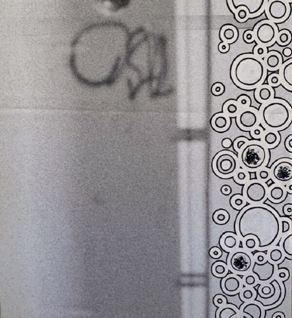
Bubbles Right, 2021
acrylic on up-cycled @vansskate vinyl banner
31 x 34 in. (78.7 x 86.4 cm)
Category: paintings
Tags: bubbles, Pat Conlon
This work was part a much larger vinyl banner (hence the upside down graffiti) that I took down to a reasonable sized work by finding an interesting composition. This was a study in minimalism; form, shape, and line direction. I took my time to finish this piece. It only came together when I broke the tension between the surface of the painting and the wall by adding a drop shadow. This forced surface change hence making depth. Less is more. I added the hidden “wishbone” and complete.


